Problem Statement
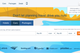
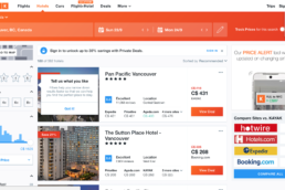
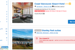
Online interactions are increasingly shaping how people plan their next trip. Many current online booking sites/aggregators have antiquated user psychology in website design and pose some common UX problems. Moreover, meta searches refer elsewhere for bookings and additionally with most online sites visitors are prompted to open multiple tabs in order to coordinate dates for flights, hotels, cars, experiences and short-term rentals – adding to a less than optimal user experience and wavering brand loyalty.
1. CLUTTERED LAYOUTS
Some websites overload their user with too much information resulting in a heavy cognitive load. Certainly, the landing page is optimal in tempting to highlight special offers. Streamlined design, however, lets the user focus on the task at hand.
2. NO MAP SEARCH TOOL
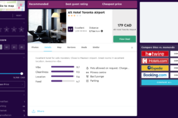
An interactive map gives users a dynamic method of searching. Maps that refresh the search parameters based on geography or destination-based pricing can also be a source of inspiration for travelers.
3. LACKING USER PERSONALIZATION
Providing users the option to choose their currency and language. Unlinking the two offers a truly customizable user experience. Also taking into consideration new versus returning visitors – the former being allowed to preview recommendations and popular destinations – this being ideal for creating inspiration if they are not set on where to go. Returning visitors should be greeted with recently viewed or searched offers that give them a more personalized experience since this demographic is 2x more likely to purchase during a session.
4. NEGLECTING RESPONSIVE DESIGN
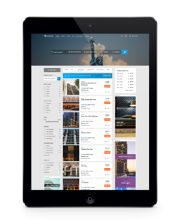
Optimising content across all devices should be standard. Users are likely to conduct some portion of their research on mobile or tablet. Although the sessions may be shorter, users need to be able to find information quickly.
5. NOT INCLUDING REVIEWS
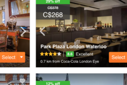
Social proof is an important driver to purchase. Integrating customer reviews in the search listings page should be commonplace
6. USER INSPIRATION
In general, e-commerce websites with clean, efficient designs promote professionalism and win trust. However, the differentiating factor for getting your customer to purchase rests on the brand’s ability to inspire wanderlust.
High-impact images
High-impact images evoke emotions within the user drawing them in visually.
Wish Lists
When researching for an upcoming trip or holiday, customers often gather as many options as possible. Implementing the wishlist function is easy to use and can be shared.
TravelTrek
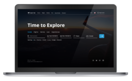
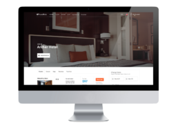
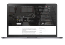
TravelTrek looks to reconcile the aforementioned UX problems giving focus to responsive, streamlined and customer-centric travel booking with a clear call to action. Adopting minimal and useful design while implementing advantageous features such as a sleek and simple landing page boasting a quick filter option, page search results with quick map toggle, wishlist classifying, international consideration of multiple languages & currencies for wider market expansion, peer & local expert reviews, and high impact images. It also offers personalized content by taking into consideration specific wants and needs and creating a better connection with users.
User Interviews
Interview: 5 people
Demographic: Male / Female
Ages: 21-40 yrs. old
1. Can you tell me of a recent frustration you encountered during your last travel booking?
2. What’s your relationship with online travel & accommodation bookings ( hotel, car, home & experience bookings)
3. What devices do you use when booking travel arrangements?
4. Can you list a positive experience with your last travel booking?
5. How do you currently book travel accommodations (hotel, car, home & experience bookings)
6. How did you hear about your current preferred online travel booking sites?
Key Findings
“Some landing pages were really overwhelming – there were far too many ads and promotions suggestions”
“I didn’t know what currency I was going to be quoted/charged in”
“I had to search for reviews elsewhere – it would be nice if there were reviews embedded.”
“It’s such a nuisance to always plug in my credit card information – I would ideally love to log in and have all of that info saved to my profile.”
“It would be wonderful to have a history of all the places I traveled and where I stayed in the past in case I want to stay there again.”
“I would love a profile list of all my family members – that way when I’m booking flights I can just select the information easily.”
RESEARCH
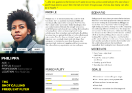
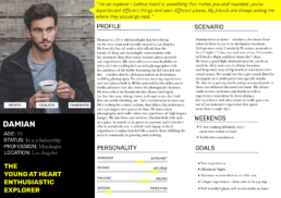
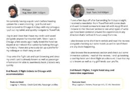
Conducting interviews it became evident that people using various online travel booking sites felt they didn’t have a hub for all their travel needs. They often found they had to compare findings to other sites – this took too long, they found better deals for cars on one site but better flight cost on another and still had to hunt for hotel specific sites that offered ideal rates alongside searching Airbnb for short-term home rental opportunities. People yearned for ease and intuitive function. They didn’t want cluttered landing pages and wanted to be able to search cross-platform. Some users had more time than others – some wanting quick results and others wanting the ease of planning and seeing what’s available. Utilizing all the pain points I was able to create various user personas.
USER-BASED SCENARIOS
FEATURE PRIORITIZATION
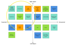
Minimum Viable Product
– Search functionality including geolocation – Gallery
– Login area (including Facebook Login) – Content personalization
– Ability to add favorites – Google maps
– TripAdvisor API – Newsletter sign-up
– Storing credit card – History of past stays
– User Curated Blog – Airbnb API
CONTENT PERSONALIZATION
Building a more relevant and personalized customer experience is critical because it helps differentiate their brands in an increasingly competitive market. The challenge arises from identifying and utilizing the right data. Strong personalization strategy should rely on a mix of first-party and third-party data.
Consideration factors:
- Location – city, country, region
- Device – iPhone, iPad, Android phone/tablet, Windows, Mac, Linux
- Customer history – prior purchases, what, how much did it cost?
- Sessions behavior – navigation clicks, page views
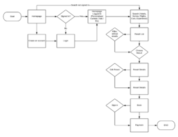
USER FLOW DIAGRAM
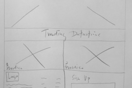
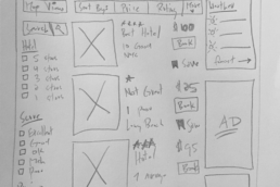
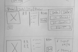
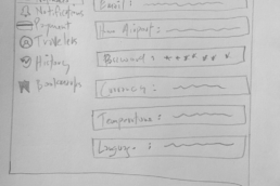
SKETCHES
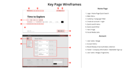
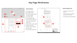
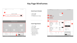
The mappings to 4 key pages integral to the user’s journey serving as paper prototypes.
USER TESTING
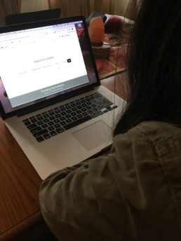
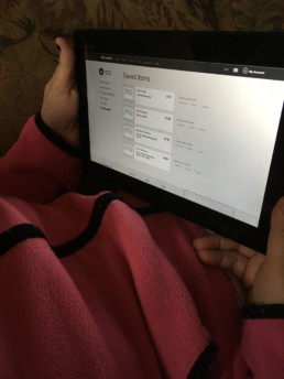
The wireframes were tested by 2 users as a prototype.
1. User Task: Starting from the quick search landing page book a flight, hotel, and experience as a guest.
2. User Task: Create a user profile including pertinent information such as currency/language preference, home airport, and other desired preferences then locate either a hotel, short-term rental or experience to add to your bookmark.
AFFINITY MAPPING
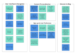
Feedback was gathered and presented below as an affinity map. Trends were identified and each user was represented by a different colored post-it note.
Style Guide
Established and enforced a set of standards to improve communication and ensure consistency and best practices.
Strategic Brand Overview
Building upon distinguishing key components of identity, brand communication and various in place strategies in order to further lasting impressions.
Logo Design
Created a graphic mark to aid and promote public identification and recognition.
Color Palettes
Implemented color psychology to attract an ideal audience while accurately representing and reinforcing the brand.
Typography
Consistency across different communication channels establishing a sense of empathy and loyalty between the brand and the audience over time.
Layout & Grids
Important fundamentals of balance, proportion, sequence, emphasis, and unity were placed on user-friendliness and engagement to optimize sessions.
Tone
Defined communication to be a purposeful and consistent expression that engages and motivates.
Copywriting
Nurtured writing as a fundamental part of a corporate voice and used it consistently to add weight and distinctiveness.
Imagery
Utilized high impact images to build trust, tell a story and guide visitors to take action
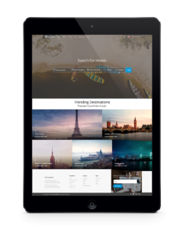
TRAVEL TREK
A responsive and streamlined conceptual online travel agency, with a focus on user efficiency, functionality & inspiring personalized content with a clear call-to-action.
ServicesArt Direction, Branding, UX/UI DesignRoleIndependent DevelopmentMethodsUser Interviews, Competitor Analysis, Personas, User Based Scenarios, Feature Prioritization, Content Personalization, User Flow Diagram, Sketches, Key Page Wireframes, User Testing, Affinity MappingToolsPen, Paper, Sketch 3, Photoshop CC, InVision
